Wednesday, November 14, 2007

Art Educators of Minnesota 2007 Awards


At the 2007 annual meeting if the Art Educators of Minnesota on November 2. Susan Rotilie and I were awarded the Museum Educator of the Year award. We joined a group of dedicated art educators who also received awards and recognition (seen here). It was a wonderful honor. Thanks go out to all art educators for their support.

Wednesday, October 31, 2007

Portrait of Aneka

This is a portrait of my wife, Aneka, that I am working on. I experimented with the ground preparation. While the last coat of gesso was still wet I broadcast into it glass microbeads, similar to the type used to make white highway lines reflective. The concept behind this was that the reflective ground would give the paint layers an added brilliance. I think it was successful.

The negative aspects of this technique are that initially the beads absorbed a lot of paint. This might be avoided by varnishing the beads layer before beginning painting. The texture of the beads was hard on my brushes and gives the finished piece a specific look, like it was painted on sand. I am not sure, yet, if that is a bad thing.

Friday, October 12, 2007

North Star Roller Girls Proposed Halloween Poster

My friend Greg asked for my assistance with bringing his design to life for this Halloween's bout poster for the North Star Roller Girls.

Greg designed the layout and the character. I inked his drawing adding some of my own ideas. Together we colored the image using Photoshop. Below is the poster we submitted to the team. We haven't yet heard if they will use our design.


Thursday, October 11, 2007

New show at Flanders Contemporary Art

Yesterday, I visited Flanders Contemporary Art, primarily to see the work of Luke Hillestad.

Hillestad is a follower of the Kitsch movement. Kitsch is championed by the Norwegian artist Odd Nerdrum. To learn more about what Kitsch is take this quiz. The painter, writer, and thinker Jan Ove Tuv wrote about Kitsch:
"THE KITSCH PAINTER SHOULD NOT BE JUDGED ON NATIONAL, RACIAL OR
RELIGIOUS GROUNDS IN HIS DEPICTION OF LIFE - BUT ON THE BASIS OF
TIMELESS QUALITIES. THE KITSCH PAINTER IS NOT PROTECTED BY THE TIME IN WHICH HE LIVES. HE STRIVES TO REPRESENT HISTORY´S MOST SUBLIME QUALITIES, AND SHOULD BE JUDGED IN ACCORDANCE WITH THESE. A WORK OF KITSCH IS EITHER GOOD OR BAD, AND GOOD KITSCH MUST NOT BE CLASSIFIED AS ART. THIS WOULD BE AN ERROR OF JUDGEMENT. KITSCH IS NOT ART. KITSCH REFERS TO THE SENSUAL AND THE TIMELESS. THE KITSCH PAINTER IS COMMITTED TO THE ETERNAL: LOVE, DEATH AND THE SUNRISE. INNOVATION IS OF NO IMPORTANCE, NOR IS ORIGINALITY. GOING IN DEPTH IS THE GOAL, FOR IN THE DEPICTION OF NATURE ITSELF LIES THE INDIVIDUAL EXPRESSION. BECAUSE MODERNISM AND ART ARE THE SAME, KITSCH IS THE SAVIOR OF TALENT AND DEVOTION." (all caps and spelling are from the original by Jan Ove Tuv)
Hillestad is working on large format canvases and on panels of a much smaller more intimate size. Many of his works explore the freedom to emulate the work of other artists that Kitsch provides. The influence of Nerdrum can be see on every wall in the gallery.

I reacted emotionally and critically to this work. The intellectual challenge presented by this work and Kitsch was brought to the fore during this experience. I am still wrestling with it.

There are some wonderful passages in the current work of this young artist. There are as many, and perhaps more, passages that left me wondering what the artist was thinking. I would love to have the opportunity to question some of the decisions he made when painting these pieces. For example, a single piece would exhibit a command of the language of light, some brilliant brush work, and some haphazard, almost clumsy knife work. The palette knife was used often and not always with success. What source was he responding to that led to the use of the knife in such a way?

While some of the work drew me in emotionally, the strongest emotional reaction was that of envy. This artist is responding to many of the same things that I excite me to paint. He is young and has an exhibition of his work in a reputable gallery. I was inspired to action. If nothing else to renew my efforts to get into the studio an work. It made me think about where I was in my career and with my own art when I was 24.

Friday, August 10, 2007

Minnesota State Fair 2007 Fine Arts Competition

From the State Fair Fine Arts Division:

Dear Treden Wagoner,

This message is to inform you that your piece titled Up Against the Wall: Wes
entered in Class 1 - Oil/Acrylic/Mixed Media was not accepted into the 2007 Fine
Arts Exhibition.

Please pick up your piece at the Fine Arts Center.


Oh well, maybe next year....

Monday, March 05, 2007

Relatively new drawing - November 2006


This is an illustration that I did for the baby show invitation for my good friend's Anthony and Diana.

Tuesday, February 20, 2007

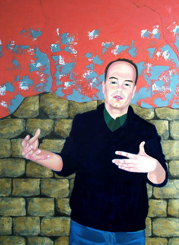
Portrait of Max: background


I worked on the background. The wall behind Max is from a New Mexican Pueblo. It adobe and stucco. Rocks suspended in the adobe can be seen where the stucco has fallen away. I painted in the brightest colors that will appear in the rocks. I began to build in the color and values in the mortar and stucco. The next step will be to work on details in the rocks. The bright colors will be toned down and each rock will have veins, fissures, and texture. As with the figure these colors will show through successive layers.

There are different colors of mortar and stucco. Throughout the wall. It is not as uniform as it appears here. That will need to be adjusted. I will add color with glazes over the existing painting. The stucco is full of aggregate. I need to figure out how I will render the texture created by all the little bits of rock and sand.

Max: Next stage (close-up)


Here is a close-up of Max's face. There are still some drawing problems I need to sort out. Something is not right with the left side (our left) of the face. The cheek is flat. It doesn't have the roundness of the other side. Is it the drawing or the use of color? I will work on that soon.

Portrait of Max: Next Stage


The painting at this stage has the background colors blocked in. I have also started to paint the figure. I have used more saturated colors at this stage. These colors will show though successive stages. The final skin tone will be made up of both physically and visually mixed colors and will be less dark. The shirt has a monochromatic under painting. I will add a plaid pattern to the shirt at a later stage.

I like to work on the whole image at the same time as much as possible. A former teacher's mantra was "Draw as a Whole." I have never forgotten this and it works for me. The next stage will be to treat the background in the same way the figure has been treated. Before moving on to the next level of detail and color the entire panel will need to be covered with the same amount of paint and the imagery brought up to the same level. In this way the entire painting evolves rather than one section at a time.

Friday, February 09, 2007

Portrait of Max with more underpainting completed

In this image you can see that I have blocked in all of the colors. This covers the white of the panel and gives me a colored base to work upon.

I paint in thin layers. This allows the white of the panel to show through the paint layer creating a unique luminosity.

The next step will be to tone down the background with a umber glaze and to begin painting the figure in colors more true to life.

Portrait of Max

Here is the beginning of the underpainting for a portrait of Max. This is the next painting in my "Up Against the Wall" series.
The drawing is done freehand in charcoal directly on the gessoed panel. Once I had the drawing the way I wanted it I painted in the major lines of the composition. The background will be a ruined wall from a New Mexican pueblo. I started blocking in the color of the adobe and mortar of the wall. The next step will be to add more color to complete the underpainting.

Portrait of Wes is nearly done

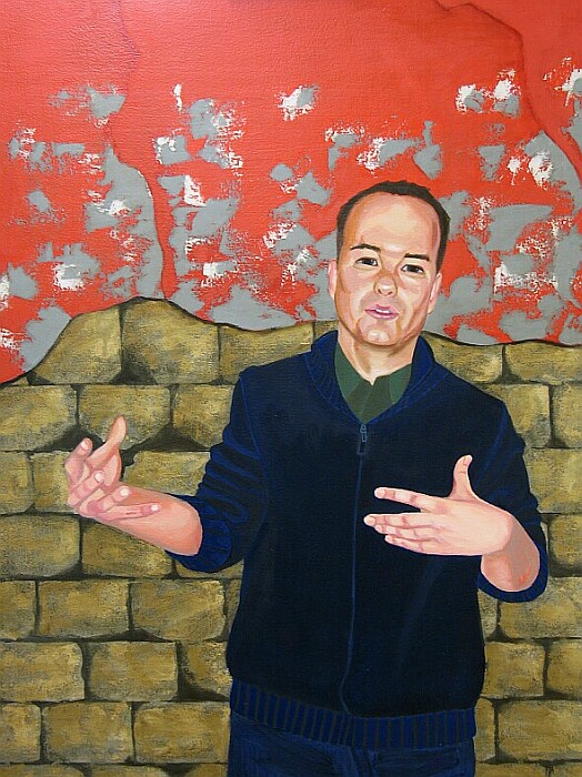
The portrait of Wes is nearly done. It is at that point where I am not sure what else to do. I have decided to let it dry completely, varnish it, and then evaluate any further additions. This painting is done entirely in oils. It is on a wood panel. It is about 40 inches high.

Portrait of Frank Zappa

I painted this portrait of Frank Zappa for my father's Christmas present. It is about 10 inches by 8 inches. It was painted in acrylics and oils on illustration board. The background includes the set list for the Minneapolis Zappa Plays Zappa concert from October 20, 2006. Tickets to the show were my gift to Dad on his 60th birthday. It was a fantastic performance.

I started with a drawing, completed a monchromatic underpainting in acrylic and finished the painting in oils.

Monday, November 13, 2006

Study for Greg


Here is the charcoal drawing of Greg.

Update: Wes


I have been working on the face during my last few studio sessions. I am pretty happy with the results. The painting is getting to a stage where a lot of the hard work is done and the fun part is beginning. Adjusting the drawing and getting the colors just right is the main focus of this work.

Here is a close-up of the face.


I need to work on his body and hands next. This past Saturday I worked on his blue cardigan. I worked to get a sense of volume and form, that there was a body underneath fabric.

Some of the feedback I have gotten on this image is that there needs to be more of the stucco in the background, not just at the top of the image. Some pieces should still be stuck to the bricks below. I am going to experiment with this later.

Next step, the hands. Stay tuned.

Thursday, March 30, 2006

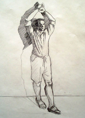
Small preparatory drawing for latest Up Against the Wall painting


I started the drawing in pencil and then began to work over the pencil in pen and ink. I have not finished the ink work. This is the pose for the next Up Against the Wall Painting.

Latest work on the Up Against the Wall paintings


I have been working on the background. I want to have the wall behind to look like a block wall that has lost some of its colored stucco. This is based on a wall I saw in New Mexico. The wall had been patched with different colored stucco over the years and what was left was a mottled quilt of red, gray, and white. I am beginning to put the finishing work on the figure. I will have new pictures of the progress soon.

I am starting two new paintings in the series as well. I have a preparatory drawing of one completed and hope to have the model for the second in the studio soon.

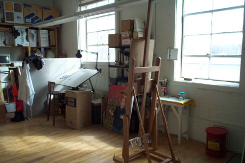
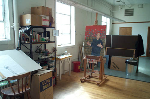
New Studio

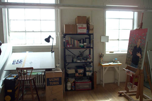
I moved into a new studio space in February. I have been very busy teaching and taking classes that I haven't spent as much time in it as I would like.

Here are some shots of the new studio.


Friday, November 04, 2005

Reference Image Archive

An Image Bank for Everyday Revolutionary Life

An Image Bank for Everyday Revolutionary Life is a multi-phase project that begins as an online photographic archive, produced and presented by e-flux, and makes publicly available for the first time over five thousand images from the 20th century. The source for this material is the collection of Mexican muralist David Alfaro Siqueiros, who compiled the photographs over the course of his own extraordinary life.